How to customize a chart
- Former user (Deleted)
Paragraphs below explain features Knoema provides to customize chart's look and feel. Before you edit a chart, make sure that you are editing the page on which the chart gadget appears.
To edit the chart, click its menu button  , and choose Edit from the list of commands that appears. The site opens the Dataset Browser interface.
- To add a dataset to the chart, switch to the Dataset Selection tab, and click the Browse Datasets button. For more information, see the How to build a chart on top of multiple sources article.
- To change the selection of elements from the dataset or the location of the data dimensions, switch to the Dimension Filter tab.
- To change the appearance of the chart, switch to the Appearance tab. For more information, see the sections that follow.
When you are finished editing the chart, click the Save button at the bottom of the page. You should also save the page that contains the chart gadget by clicking the Save link in the toolbar.
Change appearance of a chart
Сontrols under the Appearance tab enable you change the appearance of the chart in a variety of ways. Depending on type of a chart, certain controls might not be available.
Theme
The Theme control provides a number of preset color schemes. Select a color scheme from the Themes drop-down menu to apply this theme to your chart.
Chart Title
Knoema automatically creates a title consisting of dimension elements located in filters. To change the defult title, click Edit button next to title text, then type new title text and press Enter.
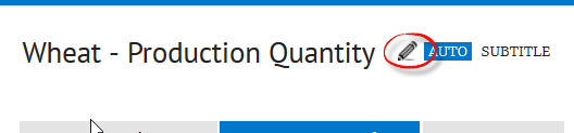
To get the default tutle back, click Auto button so it becomes highlighed.
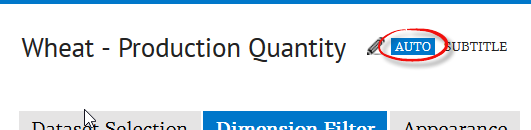
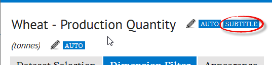
As an option, you can add a subtitle. For example, to display unit of measure of the data observed on a chart. To turn the subtitle on, click Subtitle button so it becomes highlighted. Use its Edit and Auto buttons to customize the text.
Background
Use Background Type and Background Color options to set up the color and the way the plotting area will be filled in.
Chart Type
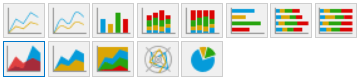
There are the following chart type available:
- Line chart. The line chart represents data series with straight line segments.
- Spline chart. The spline chart represents data series with smoothed line segments.
- Column chart. The column chart represents data series with vertical columns.
- Column value stacked chart.
- Column percentage stacked chart.
- Bar chart. The bar chart represents data series with horizontal bars.
- Bar value stacked chart.
- Bar percentage stacked chart.
- Area chart. The area chart represents data series as overlapping areas.
- Area value stacked chart.
- Area percentage stacked chart.
- Radar chart. The radar chart represent data series as line segments on a spider web.
- Pie chart. The pie chart represents data series as sections of a circle.
Value stacked charts stack data series according to their values in a single data point. Percentage stacked charts stack data series according to the percent share of each.
To change a type of your chart, simply click a corresponding item right below Chart Type label.
Knoema also has other types of visualizations such as digital maps, bubble chart and tree maps. They are present as separate gadget types.
Legend
The Legend control determines the position of the chart's legend, or the key that indicates which color represents which data series. To use this control, choose an button with a desired position of the chart's legend. To hide the legend, choose Do not display legend  .
.
Gridlines
The Gridlines control places horizontal or vertical lines against the background of the chart. Check the Horizontal or Vertical options to show the corresponding gridline on the chart.
Marker
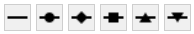
To change the shape of the point markers on the series, choose an option from the Marker control. use None to show no markers.
Precision
The Precision control determines how many decimal places appear in the chart labels. To set this control, make sure that you have checked the Display option for the Labels control, and then check an option with corresponding number. Use 0 (zero) to round lable values up to integers.
Highlight
The Highlight control adds a highlighted time range to the chart. The highlight can indicate periods of economic recession in the United States or the range of forecasted data. To use this control, choose an option from the Highlight drop-down menu. Choose None to turn the highlighting off.
- U.S. recession data. Choose U.S. Recession Data to highlight periods of economic recession in the United States.
- Forecast data - Band. Choose this option to highlight the period of forecasted data.
- Forecast Data - Line. use this option to include a line in the chart that separates reported data from forecasted data.
To set the color of the highlight, click the color swatch to the right of the Highlight drop-down menu, and pick a new color from the palette that appears.
Sort Options
The sort options determine how the data series in the chart are ordered. See How to use sorting article for details.
Footnote
A Footnote is a short piece of text at the bottom of a chart. To add, edit, or remove a footnote, follow these steps:
- Click the Footnote button. The Footnote dialog box appears.
- To remove an existing footnote, select the Not Displayed option.
- To display a link to the data source that you used for the chart, select the Auto option.
- To display your own text, select the Custom option, and type the text for the footnote in the corresponding field.
- Click OK. The Footnote dialog box closes, and the site updates the footnote on your chart.
Data Series specific options
Knoema enables you to set various display options for individual data series. These options are distinct from the general options listed above, or the options that apply to the chart as a whole. Use this feature to emphasise particular data series.
To set options for a data series, click the series in the chart. The controls on the left side of the browser window now apply to the selected data series only.
Use the controls as follows:
- To change the name of the series as it appears in the legend, type a new name in the Name field, and click Set.
- To change the type of the series, choose an option from the Series chart type control. Depending on the chart type, not all series types are available in this menu.
- To change color of the data series, click the color swatch next to Color label, and choose a new color swatch from the palette that appears.
- To change the shape of the point markers on the series, choose an option from the Marker control. Choose None if you do not want to display markers on the series.
- To change the axis on which the chart measures the series, choose Primary or Secondary option next to Axis label. Choosing Secondary causes the site to add an additional value axis to the chart.
- To show or hide labels on the series, check or uncheck the Display checkbox to the right of Labels label.
To return to the options for the chart as a whole, click the Back to global options button.
Related articles